The web design landscape evolves rapidly. Staying informed about current trends helps you make better decisions when choosing a theme, planning a redesign, or evaluating your site's competitive position. Here are the trends shaping modern WordPress development.
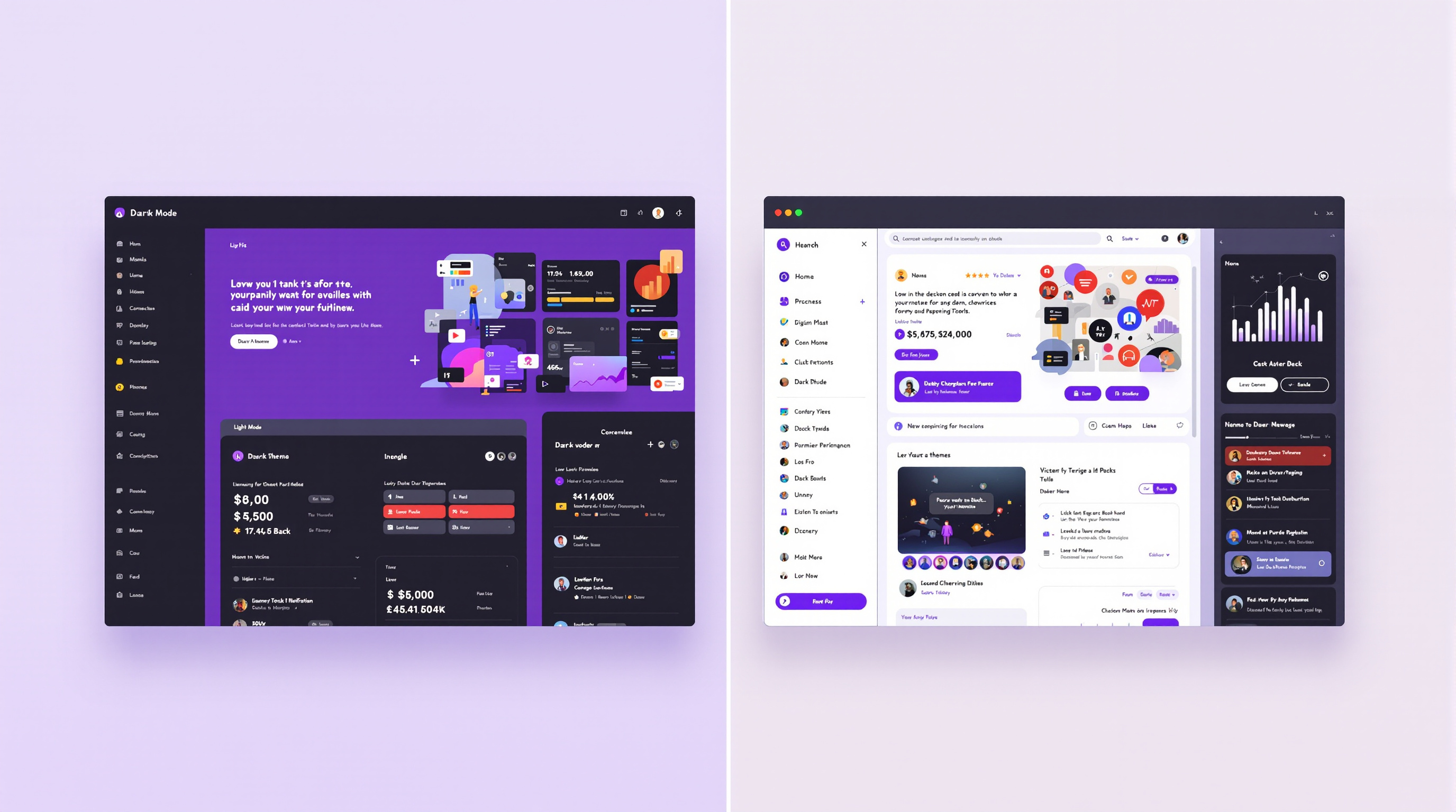
Dark Mode Support
Dark mode has moved from a novelty preference to a mainstream expectation. Operating systems, browsers, and major web applications now offer dark themes, and users increasingly expect websites to respect their system preference. CSS media queries like prefers-color-scheme: dark make it possible to serve dark-adapted color schemes automatically.
For WordPress themes, effective dark mode requires more than inverting background colors. Contrast ratios need recalculation, images may need alternative versions or opacity adjustments, and brand colors often require lightened variants to maintain visibility against dark backgrounds.
Variable Fonts
Variable fonts represent a significant advancement in web typography. A single variable font file can contain an entire range of weights, widths, and styles, replacing the need to load multiple separate font files. This reduces HTTP requests and total font payload while giving designers more granular typographic control.
Major type foundries have released variable versions of popular web fonts, including Inter, Roboto Flex, and Source Sans. Browser support is now comprehensive, making variable fonts a practical choice for production WordPress themes.
Container Queries
Container queries allow CSS styles to respond to the size of a parent container rather than the viewport. This is transformative for component-based design, enabling truly reusable UI components that adapt to their context regardless of where they appear on a page.
For WordPress themes, container queries mean sidebar widgets can use the same component as full-width sections, with layout automatically adjusting to available space. This reduces CSS complexity and makes theme architecture more modular.
Performance-First Design
Performance is no longer a technical concern alone; it is a design principle. Designers are increasingly expected to consider the performance implications of their choices, from image-heavy hero sections to animation libraries and custom font loads. The most effective modern designs achieve visual impact through thoughtful use of whitespace, typography, and color rather than relying on heavy assets.
Progressive enhancement is central to this approach. Core content and functionality should work without JavaScript, animations should respect the prefers-reduced-motion setting, and image-dependent layouts should degrade gracefully on slow connections.
Accessibility-Driven Design
Accessibility requirements are moving from voluntary guidelines to legal mandates in many jurisdictions. Forward-thinking designers are treating WCAG compliance as a design constraint from the start rather than a remediation task at the end. This shift produces better experiences for all users, not just those with specific accessibility needs.
Key focus areas include sufficient color contrast, keyboard navigability, screen reader compatibility, and clear focus indicators. Inclusive design thinking also considers cognitive accessibility through clear language, consistent navigation, and predictable interaction patterns.
Micro-Interactions and Subtle Animation
Heavy parallax scrolling and full-page transitions have given way to more restrained, purposeful animation. Micro-interactions provide feedback on user actions (button clicks, form submissions, navigation state changes) without commanding attention away from content. CSS transitions and the Web Animations API handle most of these effects without third-party libraries.
Industry Resources
Staying current with design and development trends requires following multiple sources. These resources provide reliable coverage of the evolving web landscape:
- Smashing Magazine (smashingmagazine.com) - In-depth articles on web design, development, and UX research
- CSS-Tricks (css-tricks.com) - Practical CSS techniques, layout patterns, and front-end development guides
- web.dev (web.dev) - Google's resource for modern web development best practices and Core Web Vitals guidance
- The A11Y Project (a11yproject.com) - Community-driven accessibility resources and WCAG implementation guides
We also recommend following the WordPress Developer Resources for updates on block editor development, theme standards, and upcoming WordPress features that affect theme design.